About
Regional General Hospital dr. Hasri Ainun Habibie is a Provincial Hospital Gorontalo was inaugurated in 2015. The main purpose of building a Regional General Hospital dr. Hasri Ainun Habibie is to make it easier for the people of Gorontalo Province to treatment or when in need of health services. Therefore, to give To identify the hospital, a logo in the form of an image or symbol is easily recognizable. which
later serves as a medium of internal and external promotion.
later serves as a medium of internal and external promotion.
Problem
They need a new Hospital logo design that is more representative with current hospital conditions.
My Job
Designing Logo Hospital dr. Hasri Ainun Habibie who carries the theme based on local wisdom in the form of symbols or a simple and easy-to-apply character that has the meaning of the existence of a General Hospital Regional Hospital (RSUD) dr. Hasri Ainun Habibie.
Here is the result of my work for one week for me to propose. and why is this what I propose as a new Logo? let's see!
First, I'm looking for something related to Hospital and Gorontalo area.

Words related to Gorontalo Hospital are local wisdom, health, excellence and the letter G
Gorontalo is famous for its local wisdom and I will use this concept in the Hospital Logo. then I tried to start sketching the keywords above.

I try to create the shape above so it doesn't look generic and remains relevant.
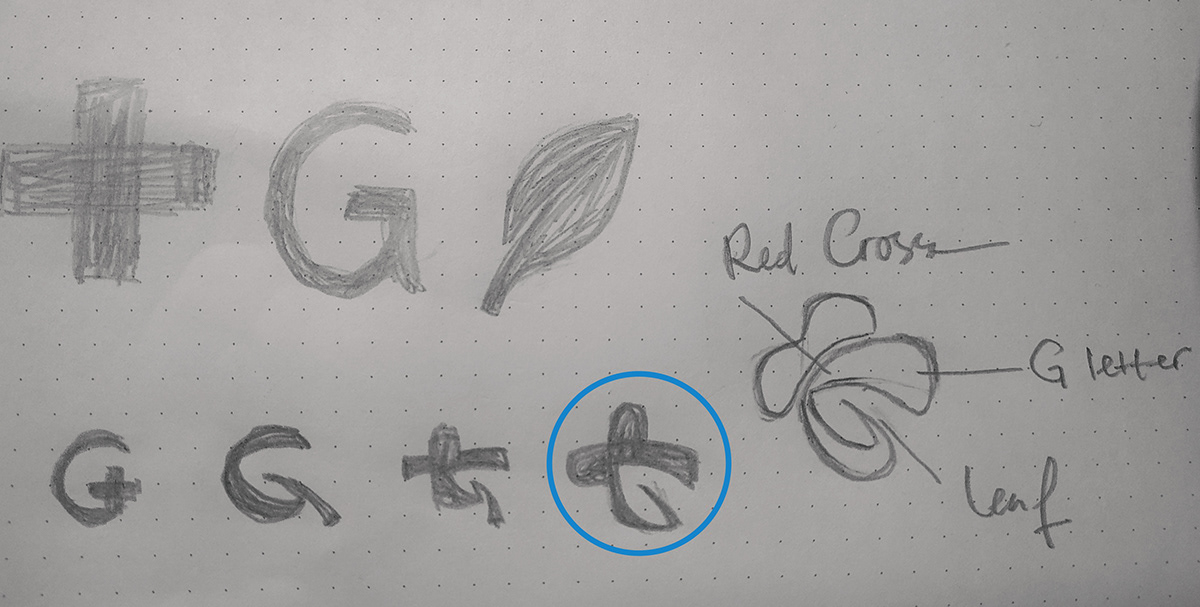
Yes, I've found a nice shape. Then turn it into a digital.

Let's give color to make it more beautiful. Here's the result

Let me explain why the shape and color is the way it is.
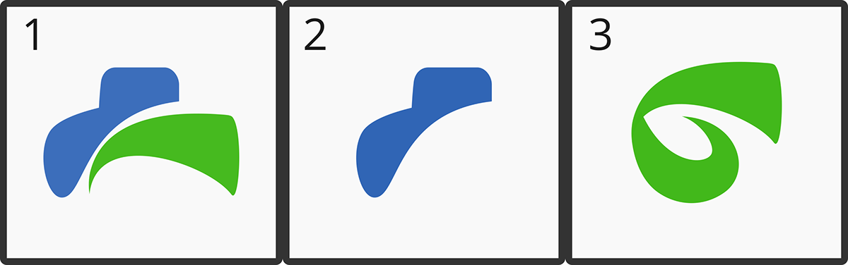
Shape
1. Dynamic Cross Symbol The Dynamic Cross symbol represents RSUD dr. Hasri Ainun Habibie, Gorontalo Province who always provides superior service, a place to treat and restore health.
2. The symbols of Water and Plants as life supports are in line with the medical service objectives of Region Hospital dr. Hasri Ainun Habibie for a better standard of living for the community.
3. The shape of the plant represents the Gorontalo area with all its Local Wisdom. This form also displays the letter 'G' which is the initials of Gorontalo.
Color
Blue stands for Trustworthy, Professional and Loyal and Green stands for Peace, Service, Refreshment and Recovery.
Here I show some examples of the application of the Logo.
Note: The text of this logo is in Indonesian

Thank you for listening.
If you like my work, press the appreciation button below. I will be happy if you give criticism and suggestions so that I can show a better work in the future.
